Identifying Oscillations
Contents
Identifying Oscillations#
Local field potential (LFP) and electroencephalogram (EEG) data both reflect the combined electrical potentials of a population of neurons. As a result, LFP and EEG data can capture neural oscillations, the rhythmic and synchronous firing of a neural population. These oscillations are observed throughout the brain, in many different frequencies, mostly ranging from 2-100Hz. Many different purposes have been attributed to neural oscillations, including synchronization of neurons for feature binding and information transfer, and clocking the relative spike timing of neurons.
Considering their ubiquity and potential function, the ability to observe and characterize neural oscillations continues to be critical to progress in neuroscience. To this end, this notebook will demonstrate how to calculate and plot:
Power spectrum
Windowed (classic) spectrogram
Wavelet based spectrogram
Frequency Domain#
import numpy as np
import matplotlib.pyplot as plt
from scipy.signal import welch, spectrogram
#Load in the LFP, stimulation time data
fpath = (r'data\\')
lfp_data = np.load(fpath+'example_lfp.npy')
fs = 1000 #sampling rate of lfp, per second
evt = 2 # time of the stimulus, in seconds
Here, we have lfp data (already filtered + resampled to 1000Hz) from an electrode in the olfactory bulb of a mouse, recording while odors are presented. At 2 seconds into the recording, an odor is presented to the mouse, and it inhales. We’ll start by plotting the lfp data around stimulus onset:
#Plot the lfp data in response to stimulation
time_segment = [int(evt*fs), int(evt*fs+1000)] #start and end event times of interest, converted to ms
plt.figure(figsize=(12,4))
plt.plot(np.arange(time_segment[0], time_segment[1], 1)-evt*fs, lfp_data[time_segment[0]:time_segment[1]])
plt.xlabel('Time post odor onset (ms)')
plt.ylabel('Voltage')
Text(0, 0.5, 'Voltage')
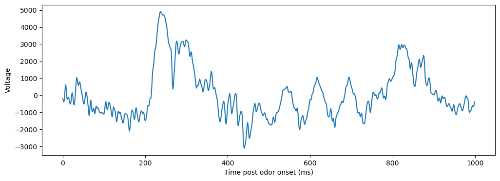
After the stimulus is presented, we see a big deflection around 200ms, a higher frequency oscillation around 400ms, and a lower frequency oscillation most prominently around 600ms. Next, we’ll want to quantify the presence of this oscillation. A common first step here is to plot the power spectrum of the data.
Power Spectrum#
The power spectrum of a signal describes the distribution of frequency components that compose that signal. It is often used to quantify the presence of different oscillations, as a power spectrum quantifies the amplitude across frequencies.
Mathmatically, comptuing a power spectrum involves two steps. First, the autocorrelation of a signal, or the correlation of a signal with itself at various time delays, is computed. Then the fourier transform of the autocorrrelation is computed, decomposing the autocorrelation into some combination of sinusoidal oscillations. Though this process can be completed once across the entire signal, this results in a noisy estimate of the power spectrum. Instead, the signal is normally segmented into a series of overlapping windows, and the power spectrum of each segment are then averaged.
In practice, this process is usually left to some pre-existing function. Here, we’ll use the welch function from scipy, which uses Welch’s method [1] to split the data into overlapping segments. Additionally, Welch’s method applies a window function to each segment, to reduce the affect of edge artifacts. The segment size and overlap are determined by the nperseg and noverlap parameters in scipy’s welch function. Feel free to mess around with these to get an idea of the tradeoffs between large and small segments, and the degree of overlap.
f, Pxx = welch(lfp_data[time_segment[0]:time_segment[1]], fs=fs, nperseg=250, noverlap=100)
f = f[np.where(f<=100)] #select only frequencies below 100Hz
Pxx = Pxx[np.where(f<=100)]
plt.figure(figsize=(10,5))
plt.plot(f, Pxx)
plt.xlabel('Frequency (Hz)')
plt.ylabel('Power Spectral Density')
Text(0, 0.5, 'Power Spectral Density')
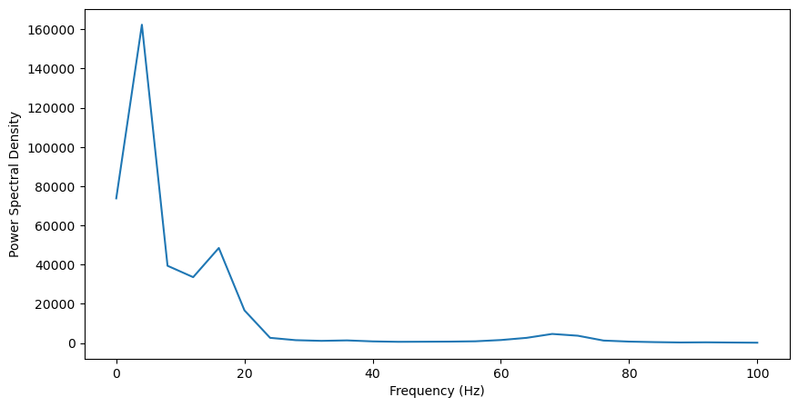
In general, the power is much higher at lower frequencies (<20Hz). This is characteristic of neural LFP data, referred to as 1/f or pink noise, where power systematically decreases with frequency. Still, we can see three peaks in power that go beyond this trend: one around 5Hz, one just below 20Hz, and another small peak around 70Hz. To better visualize this, we should remove the 1/f noise in the data. Though an excellent tool has been developed for this purpose, we can also remove this noise by normalizing to a baseline period, before odor presentation, where this noise will still be present. This will also help us identify which oscillations are specifically induced by the odor.
To do so, we’ll take the power spectrum for 1 second of data before the odor was presented, and divide the odor-evoked psd by this baseline psd. Note: Make sure your parameters match the ones you used to compute the first power spectrum, or else the frequency resolution won’t match and you won’t be able to normalize.
Pxx_evoked = Pxx
time_segment = [int(evt*fs)-1000, int(evt*fs)] #start and end event times of interest, converted to ms
f, Pxx_baseline = welch(lfp_data[time_segment[0]:time_segment[1]], fs=fs, nperseg=250, noverlap=100)
f = f[np.where(f<=100)] #select only frequencies below 100Hz
Pxx_baseline = Pxx_baseline[np.where(f<=100)]
Pxx_normalized = Pxx_evoked / Pxx_baseline
plt.figure(figsize=(10,5))
plt.plot(f, Pxx_normalized)
plt.xlabel('Frequency (Hz)')
plt.ylabel('Power Spectral Density (norm)')
Text(0, 0.5, 'Power Spectral Density (norm)')
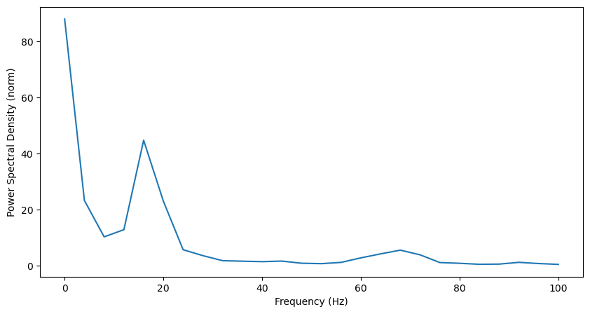
That helps a little bit: we now clearly see the peak in beta (~20Hz). There’s also a big increase in power at the lowest frequencies.
A power spectra is a useful first step for examining the oscillatory content of a time-series. However, we are still missing some information. For example, here, the gamma (~70Hz) oscillation is pretty muted. One reason for this is the gamma oscillation is brief, and here we’re looking at power over the entire second, making it hard to distinguish between a brief oscillation from a weak one. To better analyze this, let’s look at how power changes over time.
Time Frequency Domains#
Time frequency analyses, as the name indicates, introduce a time dimension to our power analyses. This allows us to analyze when exactly oscillations are present. Now, our outputs are matrices called spectrograms, plotted as heatmaps, of power over both frequency and time.
Window analysis#
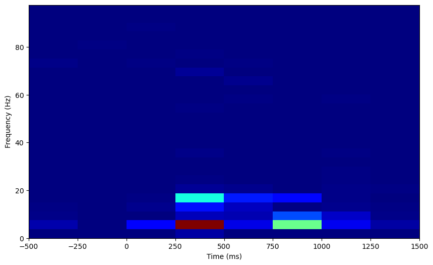
A simple and common time frequency analysis is to compute a spectrogram as a series of power spectra. Here, the data is broken up into a set of overlapping segments, and the power spectrum is computed on each of these windows. We can use scipy’s spectrogram function here.
relative_times = [-500,1500]
time_segment = [int(evt*fs)+relative_times[0], int(evt*fs+relative_times[1])] #start and end event times of interest, converted to ms
f, t, Sxx = spectrogram(lfp_data[time_segment[0]:time_segment[1]], fs)
f = f[np.where(f<=100)] #select only frequencies below 100Hz
Sxx = Sxx[np.where(f<=100)[0],:] #select only frequencies below 100Hz
plt.figure(figsize=(10,6))
plt.imshow(Sxx, extent=[relative_times[0], relative_times[-1], f[0], f[-1]], aspect = 'auto', origin = 'lower', cmap='jet')
plt.xlabel('Time (ms)')
plt.ylabel('Frequency (Hz)')
Text(0, 0.5, 'Frequency (Hz)')
Let’s normalize this too. Now that we have data on how our power changes over time, we get multiple samples of power data for each frequency, and we can z-score the evoked power to this distribution at baseline.
Sxx_evoked = Sxx
time_segment = [int(evt*fs)-2000, int(evt*fs)] #start and end event times of interest, converted to ms
f, t, Sxx_baseline = spectrogram(lfp_data[time_segment[0]:time_segment[1]], fs)
f = f[np.where(f<=100)] #select only frequencies below 100Hz
Sxx_baseline = Sxx_baseline[np.where(f<=100)[0],:] #select only frequencies below 100Hz

Sxx_normalized = np.empty(Sxx_evoked.shape)
for f_i in range(0, Sxx_evoked.shape[0]):
    Sxx_normalized[f_i, :] = (Sxx_evoked[f_i, :] - np.mean(Sxx_baseline[f_i, :])) / np.std(Sxx_baseline[f_i, :])
plt.figure(figsize=(10,6))
plt.imshow(Sxx_normalized, extent=[relative_times[0], relative_times[-1], f[0], f[-1]], aspect = 'auto', origin = 'lower', cmap='jet')
plt.xlabel('Time (ms)')
plt.ylabel('Frequency (Hz)')
Text(0, 0.5, 'Frequency (Hz)')
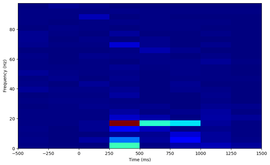
The output here is clearly very blocky, due to the windowing procedure. There’s also a tradeoff between time resolution and frequency resolution we can explore. Here, the bigger the time segment used, the finer the frequency resolution of each power spectrum, and therefore the spectrogram as a whole. However, bigger time segments decrease time resolution as well, so we can optimize the time resolution by choosing to use smaller time segments. In scipy’s spectrogram function, the length of the time segments are set by the nperseg argument, indicating the number of samples per segment. Let’s try optimizing for time or frequency resolution.
plt.figure(figsize=(12, 6))
plt.subplot(1,2,1)
time_segment = [int(evt*fs)-500, int(evt*fs)+1500] #start and end event times of interest, converted to ms

# First figure: optimize time resolution by using smaller segments
f, t, Sxx = spectrogram(lfp_data[time_segment[0]:time_segment[1]], fs, nperseg=50)
f = f[np.where(f<=100)] #select only frequencies below 100Hz
Sxx = Sxx[np.where(f<=100)[0],:] #select only frequencies below 100Hz
plt.imshow(Sxx, extent=[relative_times[0], relative_times[-1], f[0], f[-1]], aspect = 'auto', origin = 'lower', cmap='jet')
plt.xlabel('Time (ms)')
plt.ylabel('Frequency (Hz)')
plt.title('Increased time resolution')

# Second figure: optimize frequency resolution by using larger segments
plt.subplot(1,2,2)
f, t, Sxx = spectrogram(lfp_data[time_segment[0]:time_segment[1]], fs, nperseg=400)
f = f[np.where(f<=100)] #select only frequencies below 100Hz
Sxx = Sxx[np.where(f<=100)[0],:] #select only frequencies below 100Hz
plt.imshow(Sxx, extent=[relative_times[0], relative_times[-1], f[0], f[-1]], aspect = 'auto', origin = 'lower', cmap='jet')
plt.xlabel('Time (ms)')
plt.ylabel('Frequency (Hz)')
plt.title('Increased frequency resolution')
Text(0.5, 1.0, 'Increased frequency resolution')
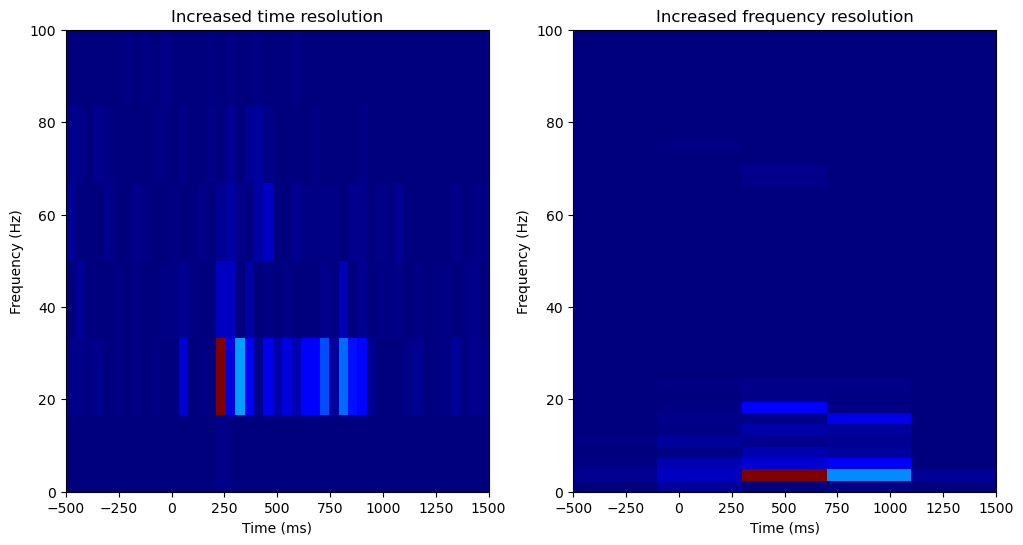
Increasing the frequency resolution, we can see power is increasing in two distinct lower frequency bands, one around 4Hz and another around 20Hz.
Overall, a window-based spectrogram is a straightforward way to extract oscillatory power over both time and frequency. However, the outputs here are very limited in both time and frequency resolution. When analyzing oscillations over long (>10s) timescales, this is not a problem, and the results will look much better than these. However, we want to analyze oscillation power over a small time window (~1s), and so currently our time and frequency resolution is poor. To better analyze oscillation power in the time and frequency domains for this short time period, a wavelet based analysis is more effective.
Morlet wavelets#
An alternative to a windowed fourier analysis is convolution with morlet (or Gabort) wavelets. These wavelets are themselves sinewaves weighted by a gaussian. This weighting provides temporal specificity, and convolving these wavelets with the signal allows for the measurement of power over time. To analyze power from different frequencies, wavelets are created from sinewaves of different frequencies. Spectrograms produced from morelet wavelet analysis are not “blocky” like the fourier analysis, as the gaussian weighting of the wavelets results in a gaussian spread of power over both time and frequency.
Fewer packages support morlet wavelet convolution. MNE is an has a great function for this we’ll use here. The package is a great resource for analyzing LFP data in python, though it is designed for EEG+MEG data.
First, let’s set up or data for mne. We need to create an info structure, and format the data into an epochs array.
import mne
info = mne.create_info(ch_names=list(map(str, np.arange(1, 2, 1))), sfreq=fs, ch_types=['eeg'])
epoch = np.empty((1, 1, len(np.arange(time_segment[0], time_segment[1],1))))
epoch[0,0,:] = lfp_data[time_segment[0]:time_segment[1]] #Format data into [epochs, channels, samples] format
epoch = mne.EpochsArray(epoch, info, verbose=False)
When we run the morlet time-frequency analysis, we’ll need to set a the parameter n_cycles. Like fourier window analyses, morelet wavelet analyses have inputs that result in a trade-off between time and frequency resolution, namely, the length of the wavelet. Longer wavelets are less precise in time, but more precise in frequency. In MNE, the length of the wavelet is determined by the n_cycles parameter, which indicates the number of cycles in the wavelets (with frequency held constant, such that more cycles results in a longer wavelet). This can be set globally for all wavelets, resulting in the same frequency specificity across wavelets of different frequencies. Let’s try this first.
freqs = np.arange(1,100)
tf_pow = mne.time_frequency.tfr_morlet(epoch, freqs=freqs, n_cycles=1, return_itc=False, average=False, verbose=False)
tf_pow.data = np.squeeze(tf_pow.data)
plt.figure(figsize=(10,6))
plt.imshow(tf_pow.data, extent=[relative_times[0], relative_times[1], tf_pow.freqs[0], tf_pow.freqs[-1]],
           aspect = 'auto', origin = 'lower', cmap='jet')
plt.xlim([0, 1000])
plt.xlabel('Time (ms)')
plt.ylabel('Frequency (Hz)')
Text(0, 0.5, 'Frequency (Hz)')
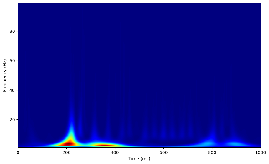
Again, we can normalize by a baseline period. MNE has an apply_baseline function on time_frequency objects we can use to here, we just need to compute the spectrogram over both the baseline and evoked periods to give the function all the data it needs.
relative_times = [-2000,1500]
time_segment = [int(evt*fs)+relative_times[0], int(evt*fs)+relative_times[1]] #start and end event times of interest, converted to ms
epoch = np.empty((1, 1, len(np.arange(time_segment[0], time_segment[1],1))))
epoch[0,0,:] = lfp_data[time_segment[0]:time_segment[1]] #Format data into [epochs, channels, samples] format
epoch = mne.EpochsArray(epoch, info, verbose=False)
freqs = np.arange(1,100)
tf_pow = mne.time_frequency.tfr_morlet(epoch, freqs=freqs, n_cycles=1, return_itc=False, average=False, verbose=False)
tf_pow.apply_baseline(mode='zscore', baseline=(.2, 1.800)) #add a little padding for the baseline
tf_pow.data = np.squeeze(tf_pow.data)
plt.figure(figsize=(10,6))
plt.imshow(tf_pow.data, extent=[relative_times[0], relative_times[1], tf_pow.freqs[0], tf_pow.freqs[-1]],
           aspect = 'auto', origin = 'lower', cmap='jet')
plt.xlim([0, 1000])
Applying baseline correction (mode: zscore)
(0.0, 1000.0)
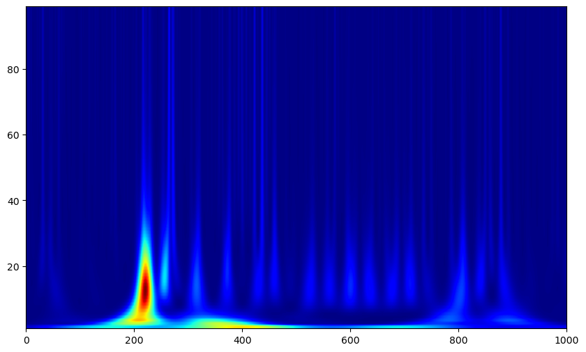
This looks better, but this spectrogram still appears smeared over time at low frequencies while varying sharply at high frequencies. This is because when we set n_cycles globally, the time specificity of each wavelet will vary, as one cycle of a 2Hz oscillation takes much more time than one cycle of a 20Hz oscillation. Therefore, weighting the number of cycles of wavelets by their frequencies is often preferable.
relative_times = [-2000,1500]
time_segment = [int(evt*fs)+relative_times[0], int(evt*fs)+relative_times[1]] #start and end event times of interest, converted to ms
epoch = np.empty((1, 1, len(np.arange(time_segment[0], time_segment[1],1))))
epoch[0,0,:] = lfp_data[time_segment[0]:time_segment[1]] #Format data into [epochs, channels, samples] format
epoch = mne.EpochsArray(epoch, info, verbose=False)
freqs = np.arange(1,100,4)
n_cycles = freqs / 2
tf_pow = mne.time_frequency.tfr_morlet(epoch, freqs=freqs, n_cycles=n_cycles, return_itc=False, average=False, verbose=False)
tf_pow.apply_baseline(mode='zscore', baseline=(.2, 1.800)) #add a little padding for the baseline
tf_pow.data = np.squeeze(tf_pow.data)
plt.figure(figsize=(10,6))
plt.imshow(tf_pow.data, extent=[relative_times[0], relative_times[1], tf_pow.freqs[0], tf_pow.freqs[-1]],
           aspect = 'auto', origin = 'lower', cmap='jet')
plt.xlim([0, 1000])
plt.xlabel('Time (ms)')
plt.ylabel('Frequency (Hz)')
Applying baseline correction (mode: zscore)
Text(0, 0.5, 'Frequency (Hz)')
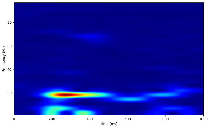
Now, we can see a clear oscillation at 20Hz, and a weak oscillation around 70Hz, around 400ms post odor presentation.
Limitations
Each of these analyses measures the power of sinusoidal oscillations. However, neural oscillations are often non-sinusoidal, and this can lead to some erroneous outputs. For example, a non-sinusoidal oscillation will often lead to spurious peaks in power at harmonic frequencies of the actual oscillation frequency. This occurs when the fourier analysis decomposes the non-sinusoidal oscillation into a sinusoidal oscillation at its true frequency, resulting in leftover signal that is then decomposed into harmonics of the true frequency [2].
These tutorials have covered basic oscillatory analyses. The next tutorial will cover slightly more advanced analyses, in order to uncover how multiple oscillatory signals relate to each other.
References#
P. Welch, “The use of the fast Fourier transform for the estimation of power spectra: A method based on time averaging over short, modified periodograms”, IEEE Trans. Audio Electroacoust. vol. 15, pp. 70-73, 1967.
Donoghue, T., Schaworonkow, N., & Voytek, | Bradley. (2021). Methodological considerations for studying neural oscillations. https://doi.org/10.1111/ejn.15361
