Spike Train Analyses
Contents
Spike Train Analyses#
Analyses of neural spiking activity are central to invasive electrophysiological data analyses. Spikes are extracted and attributed to different neurons from recordings using algorithms like spyking-circus, such that neuroscientists can analyze a series of spike times from each recorded neuron. Most analyses of spiking data focus on how stimuli affect spike rates. Ultimately, neuroscientists often investigate how well this information can reflect the stimuli. Additionally, though neural oscillations are most commonly assessed using the LFP data, the oscillatory activity of individual neurons can be measured. This tutorial will cover these analyses; specifically:
Raster plot
Spike rate estimation using kernels
Autocorrelation
Power analyses of spike rate data (PSD, time-frequency power)
PCA visualization
import numpy as np
import matplotlib.pyplot as plt
import elephant
from neo.core import AnalogSignal
import quantities as pq
import mne
from scipy.signal import welch
from sklearn.decomposition import PCA
First, we will simulate a neural spike train, an array of spike times for a neuron. For this and later analyses, we will use elephant [1]. Though elephant supports analyses of spike trains and LFP data, the package is particularly helpful for spike train analyses. For input, elephant often requires input data to be formatted using the quantity and neo packages: quantity allows the unit of measurement (seconds, milliseconds, Hz) to be tied to a numpy array, and neo supports electrophysological signal data objects, allowing data to be packaged with relevant information (such as the recorded time range of a spike train).
Here, we’ll simulate a spike train using elephant’s spike_train_generation module. We will use the inhomogeneous_poisson_process function, allowing us to specify a firing rate that fluctuates rhythmically at 20Hz.
# Simulate a neuron with an oscillating firing rate

fs = 1000
times = np.arange(0, 1, 1/fs)
freq = 20
mean_rate = 60
osc = np.sin(2 * np.pi * times[:] * freq)
osc_rate = mean_rate * osc
osc_rate += mean_rate #make sure rate is always positive
sim_spike_rate = AnalogSignal(np.expand_dims(osc_rate, 1), units='Hz', sampling_rate=1000*pq.Hz)
spiketrain = elephant.spike_train_generation.inhomogeneous_poisson_process(rate=sim_spike_rate, refractory_period=3*pq.ms)
Raster plot#
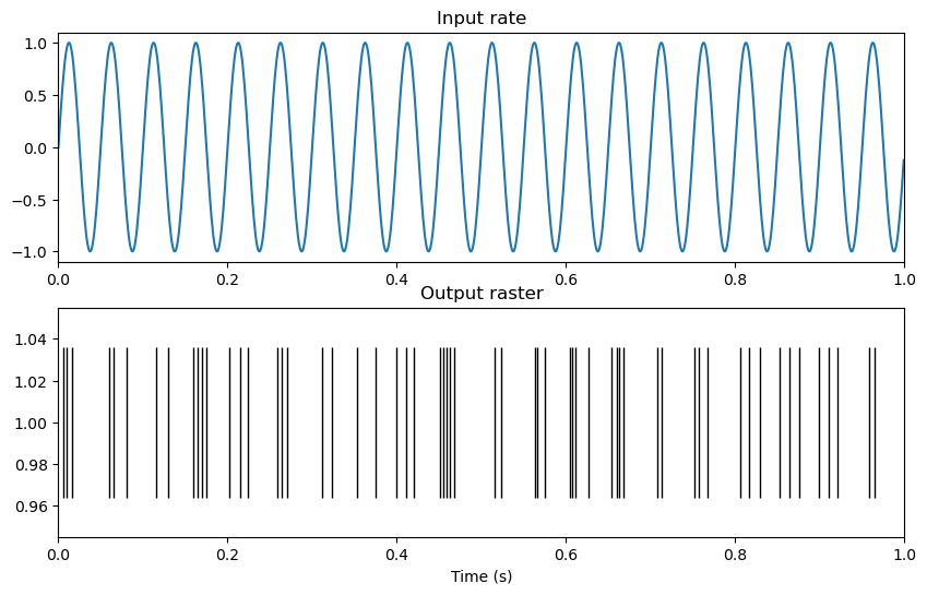
The spiketrain output now contains an array of spike-times, which we can visualize using a raster plot. A raster plot visualizes spike times as vertical lines.
plt.figure()
spikes = np.squeeze(spiketrain)
plt.figure(figsize=(10,6))
plt.subplot(2,1,1)
plt.plot(times, osc)
plt.title('Input rate')
plt.xlim([0,1])
# plt.tick_params(bottom = False, labelbottom = False)
plt.subplot(2,1,2)
plt.plot(spikes, np.ones_like(spikes), '|', markersize=100, color='black')
plt.xlim([0,1])
plt.title('Output raster')
plt.xlabel('Time (s)')
Text(0.5, 0, 'Time (s)')
<Figure size 640x480 with 0 Axes>
Spike rate estimation#
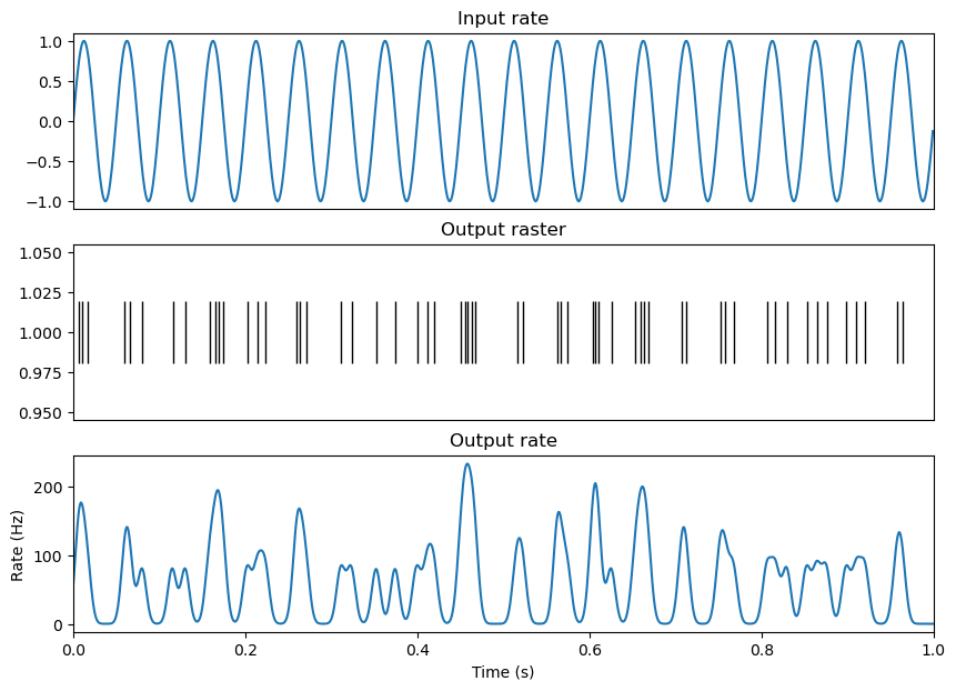
It is often useful to estimate how the spike rate of a neuron changes over time. A classical and effective method is kernel density estimation, where a kernel function is convolved with a spike train [2]. Common kernel functions include a gaussian kernel, which facilitates a smooth estimate of spike rate over time, or an exponential kernel, which can be used to prevent the smoothing of spike rate estimation backwards in time. Additionally, the user must decide the width of the kernel. Wider kernels smooth the spike rate estimation over longer periods of time (and thus risk smoothing over important changes in spike rate), while narrow kernels can produce noisy fluctuations in firing rate estimation. Here, I’ve selected a guassian kernel with a width (or standard deviation in time) of 5ms, where we can observe firing rate increase and decrease over the 20Hz (50ms cycle) rhythm.
# Apply a kernel to extract firing rate from spike train

kernel_size = 5*pq.ms
spike_sr = 1000
real_spike_rate = elephant.statistics.instantaneous_rate(spiketrain, sampling_period=1 / spike_sr * pq.s,
                                                   kernel=elephant.kernels.GaussianKernel(sigma=kernel_size))
plt.figure(figsize=(10, 7))
plt.subplot(3,1,1)
plt.plot(times, osc)
plt.title('Input rate')
plt.xlim([0,1])
plt.tick_params(bottom = False, labelbottom = False)
plt.subplot(3,1,2)
plt.plot(spikes, np.ones_like(spikes), '|', markersize=40, color='black')
plt.title('Output raster')
plt.tick_params(bottom = False, labelbottom = False)
plt.xlim([0,1])
plt.subplot(3,1,3)
plt.plot(times, np.squeeze(np.asarray(real_spike_rate)))
plt.xlim([0,1])
plt.title('Output rate')
plt.xlabel('Time (s)')
plt.ylabel('Rate (Hz)')
Text(0, 0.5, 'Rate (Hz)')
Rhythmicity#
Autocorrelation#
Performing an autocorrelation on this spiketrain will allow us to capture its rhythmicity. Generally, an autocorrelation of a spike train computes the difference between the spike time of each spike with all other spike times in the spike train. If the neuron fires rhythmically, this will be reflected in the autocorrelation as an increased number of spikes at multiples of some time difference relative to 0.
# Compute autocorrelation of neuron

binsize = .005
histo_bins = int((times[-1]-times[0])/binsize)
spike_diffs = []
for i, spike1 in enumerate(spikes):
    for j, spike2 in enumerate(spikes):
            if not spike1==spike2:
                spike_diffs.append(spike1 - spike2)

counts, bins, patches = plt.hist(spike_diffs, bins=histo_bins)
plt.xlabel('Time lag (s)')
plt.ylabel('Count')
Text(0, 0.5, 'Count')
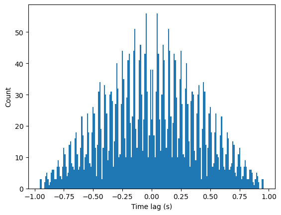
Here, we can see some rhythmicity in the comb-like appearence of the histogram, reflecting repeated time differences where spikes are more likely to occur. However, there is also a clear decrease in spike counts as the time differences increase. This is an artifact resulting from computing the autocorrelation at the beginning and end of the spike train. When comparing the time differences of other spikes relative to the first spike, time differences can only be positive, and for the last spike, time differences can be negative. Similarly, only spikes at the very beginning or end of the spike train can have a time difference with another spike close to 1. As we compute using spikes closer to the center of the spike train, the window of possible spike times increases, resulting in a linear increase in overall spike counts as time differences move closer to 0.
This artifact is really only relevant when computing auto-correlations on a short spike train, when the time differences of interest can approach the length of the spike train. Therefore, when computing an overall autocorrelation over the course of a recording, this will not be a problem, but when computing an autocorrelation over the course of a second or two (e.g. to see whether a stimulus induced rhythmicity), this affect will need to be addressed.
To remove this effect, establish the maximal time lag of interest. We can then selectively analyze spikes that occur after the beginning of our recording + this lag, or before the end of our recording - this lag, such that +/- this lag is contained in our recording period. Increasing this maximal lag will result in fewer valid spikes in our sample, while decreasing this lag will result in a smaller window of time lags analyzed.
# Compute autocorrelation for only valid spikes

binsize = .005
max_lag = .2
start_win, stop_win = times[0] + max_lag, times[-1] - max_lag
histo_bins = int((max_lag*2)/binsize)

spike_diffs = []

for i, spike1 in enumerate(spikes):
    if spike1>start_win and spike1<stop_win:
        for j, spike2 in enumerate(spikes):
                if not spike1==spike2:
                    spike_diff = spike1 - spike2
                    if np.abs(spike_diff)<max_lag:
                        spike_diffs.append(spike1 - spike2)

counts, bins, patches = plt.hist(spike_diffs, bins=histo_bins)
plt.xlabel('Time lag (s)')
plt.ylabel('Count')
Text(0, 0.5, 'Count')
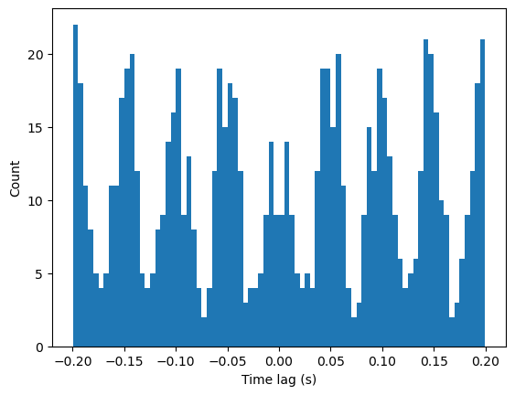
Here, we see peaks at -50 and 50 ms, and every multiple of that time lag, indicating rhythmic spiking every 50ms or 20Hz.
Power metrics of spike rate#
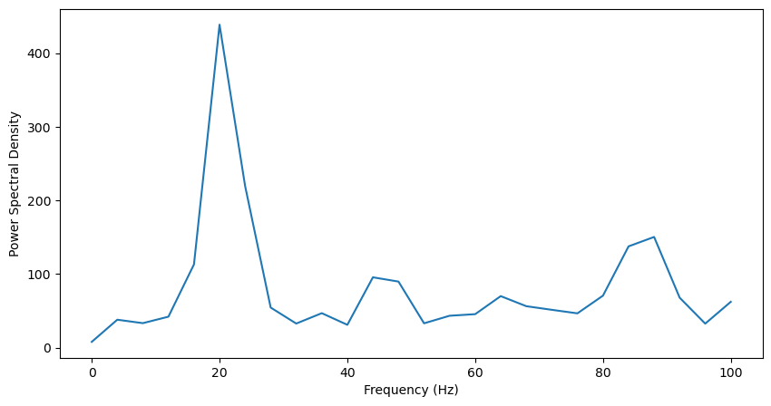
Analyses applied to quantify LFP oscillatory power can also be applied to the spike rate estimation of our spike train [3]. Here, the kernel size must be chosen carefully, as a kernel smoothing the spike train over a long period of time will smear high frequency rhythmic activity, while smoothing over short periods of time can lead to a noisy signal. Here, we’ll analyze the power spectrum and time frequency power of the spike rate.
sampling_period = 1 * pq.ms
kernel_size = 5 * pq.ms
Fs = int(1000/float(sampling_period))
kernel_size = sampling_period
kerneled_spike_rate = elephant.statistics.instantaneous_rate(spiketrain, sampling_period=1 / spike_sr * pq.s,
                                                   kernel=elephant.kernels.GaussianKernel(sigma=kernel_size))
kerneled_spike_rate = np.squeeze(np.asarray(kerneled_spike_rate))
f, Pxx = welch(kerneled_spike_rate, fs=fs, nperseg=250, noverlap=100)
f = f[np.where(f<=100)] #select only frequencies below 100Hz
Pxx = Pxx[np.where(f<=100)]
plt.figure(figsize=(10,5))
plt.plot(f, Pxx)
plt.xlabel('Frequency (Hz)')
plt.ylabel('Power Spectral Density')
Text(0, 0.5, 'Power Spectral Density')
info = mne.create_info(ch_names=['1'], sfreq=Fs, ch_types=['eeg'])
epoch = np.empty((1, 1, len(kerneled_spike_rate)))
epoch[0,0,:] = kerneled_spike_rate #Format data into [epochs, channels, samples] format
epoch = mne.EpochsArray(epoch, info, verbose=False)
freqs = np.arange(1,100,4)
n_cycles = freqs / 2
tf_pow = mne.time_frequency.tfr_morlet(epoch, freqs=freqs, n_cycles=n_cycles, return_itc=False)

tf_pow.data = np.squeeze(tf_pow.data)
plt.figure(figsize=(10,6))
plt.imshow(tf_pow.data, extent=[times[0], times[-1], tf_pow.freqs[0], tf_pow.freqs[-1]],
           aspect = 'auto', origin = 'lower', cmap='jet')
plt.xlabel('Time (ms)')
plt.ylabel('Frequency (Hz)')
[Parallel(n_jobs=1)]: Using backend SequentialBackend with 1 concurrent workers.
[Parallel(n_jobs=1)]: Done   1 out of   1 | elapsed:    0.0s remaining:    0.0s
[Parallel(n_jobs=1)]: Done   1 out of   1 | elapsed:    0.0s finished
Text(0, 0.5, 'Frequency (Hz)')
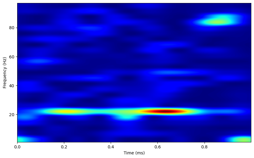
The power spectrum displays a strong peak at 20Hz, and the time-frequency representation shows some periods where 20Hz power is high. Overall, these methods are usually more effective when applied to LFP data, as the binary nature of neural spiking activity often results in noisy data. Still, these analyses can be useful in the absence of lfp data, or to analyze oscillatory activity individually in neurons.
Stimulus encoding#
A common step in electrophsiological experiments is to assess whether neural spiking activity can reflect stimulus information. Usually, this is done using spike rates, assuming neurons respond to stimuli by increasing their spike rate. Here, we’ll visualize stimulus responses using raster plots, and later PCA analysis.
Raster plots#
Let’s say we have a neuron responding to 4 stimuli, where the neuron’s response depends on the stimuli. First, we’ll plot how individual neurons respond to different stimuli. To do so, let’s make a raster plot, where different stimuli are plotted using different colors.
n_stim = 4
n_units = 1

colors = plt.rcParams['axes.prop_cycle'].by_key()['color']

# Make a matrix of stimulus response rates
response_rates = np.zeros((n_units, n_stim))
max_rate = 60
for u in range(0,n_units):
    for s in range(0,n_stim):
        response_rates[u, s] = max_rate*np.random.random([1])[0]

# Simulate trials for each neuron and stimulus, and count spikes over a second period
n_trials = 10
matrix_defined = False
trial_count = 0
for s in range(0,n_stim):
    response_counts = np.zeros((n_trials, n_units))
    for trial in range(0, n_trials):
        for u in range(0,n_units):
            spiketrain = elephant.spike_train_generation.StationaryPoissonProcess(rate=response_rates[u, s]*pq.Hz,
                                                                                  refractory_period=3*pq.ms).generate_spiketrain()
            spikes = np.squeeze(spiketrain)
            plt.plot(spikes, trial_count*np.ones_like(spikes), '|', markersize=4, color=colors[s])
            trial_count+=1

plt.xlabel('Time (s)')
plt.ylabel('Trial')
Text(0, 0.5, 'Trial')
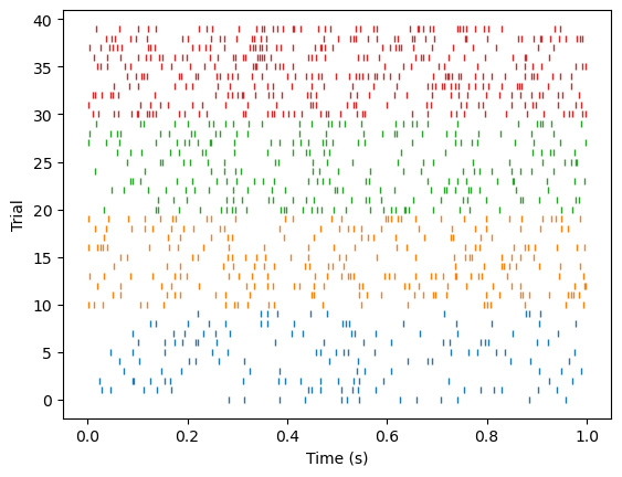
The neuron’s response rate should reflect the stimuli.
Principle Component Analysis#
Now, what if we have 10 neurons, each with independent stimulus preferences. We’d like to be able to assess how these neurons could encode for stimuli as a population. However, we can’t effectively visualize the activity of 10 neurons over 10 trials and 4 stimuli. Instead, we can use principle component analysis (PCA) to reduce the activity of the population of neurons into 2 or 3 components.
PCA reduces some features into a smaller number of components. In neuroscience, PCA is used to reduce the activity from some number of neurons into 2 or 3 components so that the data can be easily summarized and visualized. PCA works by iteratively finding the vector such that the projection of the data onto this vector best captures the variance in the data. The following vectors, or components, are then identified to capture the remaining variance in the data while being orthogonal to the previous components. Mathmatically, the fist step of PCA analysis is to compute the covariance matrix of the data. The components are then identified as the eigenvectors of the covariance matrix, and the variance each component captures is indicated by their eigenvalues.
In interpreting the results of a PCA analysis, there are a few important points to remember. First, principle components are linear combinations of the initial variables: the actual output of a PCA decomposition is this weighting matrix, which must be multiplied with the original data to transform the data into PCA-space. Additionally, components are linearly uncorrelated with each other. Finally, since PCA iteratively captures as much variance as possible with each component, each subsequent component will capture less variance than the previous component [4].
In sklearn’s PCA function, the input matrix needs to be formatted such that the first dimension corresponds to each sample, and the second corresponds to each feature (here, neuron). We want to input all of our trials, regardless of the stimulus, into sklearn (but be able to organize by stimulus later), so here we’ll stack trials from different stimuli along the first dimension, creating a matrix that is (n_stim x n_trials) by n_units.
n_stim = 4
n_units = 10

# Make a matrix of stimulus response rates
response_rates = np.zeros((n_units, n_stim))
max_rate = 60
for u in range(0,n_units):
    for s in range(0,n_stim):
        response_rates[u, s] = max_rate*np.random.random([1])[0]

# Simulate trials for each neuron and stimulus, and count spikes over a second period
n_trials = 10
matrix_defined = False
for s in range(0,n_stim):
    response_counts = np.zeros((n_trials, n_units))
    for trial in range(0, n_trials):
        for u in range(0,n_units):
            spiketrain = elephant.spike_train_generation.StationaryPoissonProcess(rate=response_rates[u, s]*pq.Hz,
                                                                                  refractory_period=3*pq.ms).generate_spiketrain()
            response_counts[trial, u] = len(spiketrain)

    if matrix_defined:
        feature_matrix = np.concatenate((feature_matrix, response_counts), axis=0)
    else:
        feature_matrix = response_counts
        matrix_defined = True

feature_matrix.shape
(40, 10)
We can then perform PCA decomposition on this matrix, and plot the newly reduced dataset by which stimuli the trials came from.
#Decompose data using PCA
pca = PCA(n_components=3)

pca.fit(feature_matrix)
X = pca.transform(feature_matrix)

#Plot PCA
fig, ax = plt.subplots(subplot_kw={"projection": "3d"})

colors = plt.cm.rainbow(np.linspace(0, 1, n_stim))
for stim in range(0, n_stim):
    color = colors[stim]
    start = stim*n_trials
    stop = (stim+1)*n_trials
    ax.scatter(X[start:stop, 0], X[start:stop, 1], X[start:stop, 2], color=color, edgecolor='k')

    pc1_mean, pc2_mean, pc3_mean = np.mean(X[start:stop, 0]), np.mean(X[start:stop, 1]), np.mean(X[start:stop, 2])
    pc1_sem, pc2_sem, pc3_sem = np.std(X[start:stop, 0]), np.std(X[start:stop, 1]), np.std(X[start:stop, 2])

    phi = np.linspace(0, 2 * np.pi, 256).reshape(256, 1)  # the angle of the projection in the xy-plane
    theta = np.linspace(0, np.pi, 256).reshape(-1,256)  # the angle from the polar axis, ie the polar angle
    x = pc1_sem * np.sin(theta) * np.cos(phi) + pc1_mean
    y = pc2_sem * np.sin(theta) * np.sin(phi) + pc2_mean
    z = pc3_sem * np.cos(theta) + pc3_mean
    ax.plot_surface(x, y, z, color=color, alpha=0.5,
                       linewidth=0)
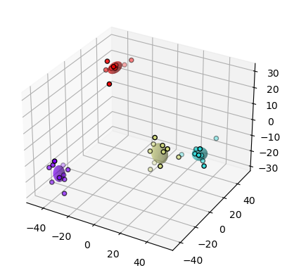
The stimuli are clearly separated in PCA space. Here, we’ve only visualized this separation by stimuli, but it can be quantified as the degree of overlap of each stimulus separated distribution. This quantification can also occur in the original dimensionality of the data. Many papers will also quantify the separability of these distributions through machine learning. Usually, these methods investigate how well a simple machine learning algorithm can separate these distributions.
These tutorials covered relatively general spike train analyses. The next tutorial, Spike_Synchrony, covers a particular area of interest to our lab.
References#
Denker M, Yegenoglu A, Grün S (2018) Collaborative HPC-enabled workflows on the HBP Collaboratory using the Elephant framework. Neuroinformatics 2018, P19. doi:10.12751/incf.ni2018.0019
Sanderson, A. C. (1980). Adaptive filtering of neuronal spike train data. IEEE Transactions on Bio-Medical Engineering, 27(5), 271–274. https://doi.org/10.1109/TBME.1980.326633
Burton, S. D., & Urban, N. N. (2021). Cell and circuit origins of fast network oscillations in the mammalian main olfactory bulb. ELife, 10. https://doi.org/10.7554/ELIFE.74213
Hastie, T. et. all. (2009). Springer Series in Statistics The Elements of Statistical Learning. In The Mathematical Intelligencer (Vol. 27, Issue 2). http://www.springerlink.com/index/D7X7KX6772HQ2135.pdf
